


TRAINLINE APP REDESIGN
Role
Solo UX Designer | UX Researcher
Methodologies
Research, Analysis, Design, Prototype
Tools
Figjam, Pen & Paper, Figma
Duration
3 Weeks
Introduction
If you frequently travel on trains, then the Trainline app must ring a bell. Used by millions across Europe, it has become the most popular mobile app to view live train times and purchase tickets. However, for someone like me who does not travel as frequently on trains, I was left scratching my head when I was first introduced to the app. After encountering a maze of cluttered screens and unclear pricing models, I took it upon myself to redesign the application.
Challenge
The challenge became clear; to utilise my UX design skills to redesign the app to create a improved and user friendly experience.
Goals
-
Conduct research methods to better understand the problem at hand.
-
Analyse the research to uncover common user pain points and weak UX spots.
-
Design a solution to solve the research patterns.
-
Create a prototype that can visually bring the solution to life.
Research
1
Analysis
Design
Prototype
App Reviews
To gain a better understanding of the app’s current problems, I decided to view some reviews that users had left.


-
Tickets are more difficult to find because of the messy interface.
-
Ticket prices are not clear, resulting in users purchasing the wrong ticket.
-
There is no option to download tickets.
-
User friction is occurring because of information overload.
App Audit
Next I decided to conduct an app audit to further investigate the problems users were discussing in their reviews. Here is what I found.


S1
S2
S3
S4


S5
S6
S7
S8
S1 - Poor colour contrast between the search bar and background colour.
S1- Disrupted visual hierarchy with thr image used to promote ticket discounts.
S2 - Users need to constantly scroll the time selector element.
S3 - Unclear iconography.
S3 - No option to filter tickets.
S4 - Unnecessary and misleading.
S5 - Users are asked twice in the flow if they want insurance, creating annoyance.
S6- Too cluttered with unnecessary information.
S7 - Travel insurance is asked again.
S8 - Dark pattern to opt out of marketing notifications.
Usability Test
To better understand the problem at hand, I invited two participants to perform usability test. This was an opportunity to identify their context, goals, behaviours and pain points.
Research
Analysis
2
Design
Prototype
Affinity Diargram
Now that the research was complete, it was time to uncover the common patterns using a affinity diagram. Here is what I discovered.


-
Poor navigation is the leading cause of poor user experience. This then leaves users second guessing if they have completed tasks successfully.
-
The scroll bar used to choose date/time is not designed effectively as participant two struggled to use it. For example, the layout is not very practical as participant two fiddled around and unintentionally clicked buttons.
-
Both participants slightly struggled with the terminology on the ticket types screen. Poor layout design again could be the main cause of this.
Customer Journey Map
To synthesise better with users, I created a customer journey map to better understand their thought process.

-
Poor UX occurs the moment users enter their date/time, further influencing the priority of it being redesigned.
-
Not much change is needed on the search bar as users seem satisfied.
-
Some work is also needed on the results page to remove the clutter and junk.
Research
Analysis
3
Design
Prototype
User Persona
From the research and analysis, I created a user persona to understand the target audience.

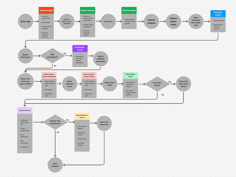
User Flow
Before designing the flow, I first identified the app’s current flow to see where changes could be made. Below you can see the changes that I had made.
Before
After

-
The flow was unnecessarily long. For example I did not think it was necessary to to have a dedicated screen for single purposes, such as having a dedicated screen to choose the number of passengers.
-
Multiple screens are filled with junk content. For example, having the Co2 information on the payment screen. Therefore junk was removed in the redesign.
-
As navigation was a priority to focus on, I identified that there was a lack of filter options. For example, users needed to constantly scroll to find direct trains.
Sketches
Now it was time to start visually building the redesign. But before I hopped on figma, I first sketched out the design on paper to get a rough idea of how the prototype will look.


Colours & Typography
By sticking with the 60%-30%-10% rule, I was able distinguish colours for different use cases, maintaining a clean interface throughout. In terms of typography I went with something versatile with a lot of weights, therefore landing ‘Inter’.
60%
#FFFFFF
30%
#EBEBEB
10%
#00A88F
Heading
Lorem ipsum dolor sit amet, consectetur adipiscing elit. Sed do eiusmod tempor incididunt ut labore et dolore magna aliqua. Ut enim ad minim veniam, quis nostrud exercitation ullamco laboris nisi ut aliquip ex ea commodo consequat.
Wireframes
After designing my first draft of wireframes, I conducted a usability test with a user to validate the redesign. After the test It was clear that the UI needed some work. Below you can view the test and see the changes I made after.


Draft


Final
Research
Analysis
4
Design
Prototype
Prototype
Now that the wireframes was complete, it was time to bring it to life by adding the prototype. Below you can see how it functions.
